Ace and Everett
A modern luxury sock brand looking to improve their web presence through a website re-design.
A modern luxury sock brand looking to improve their web presence through a website re-design.
I was tasked with re-designing their Homepage, About Us and Shop pages in order to increase conversion rates.
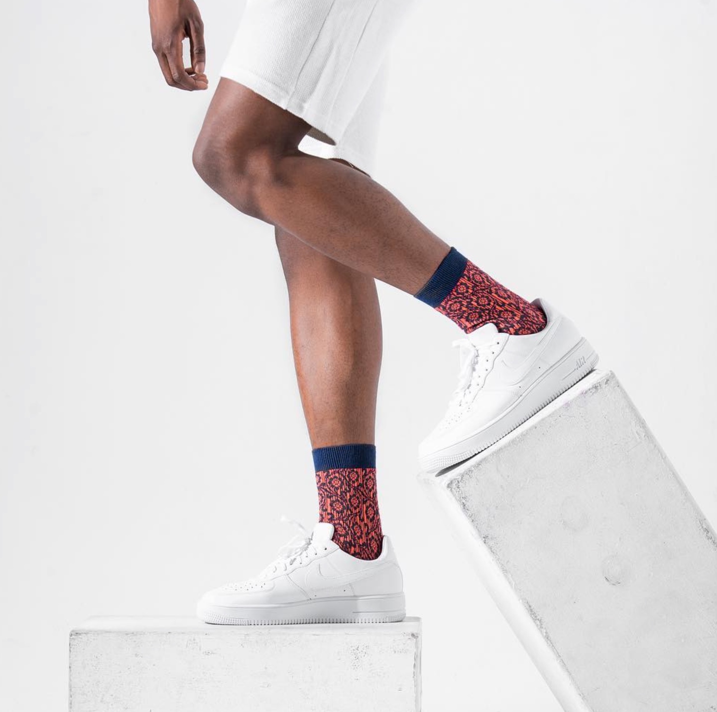
Ace and Everett socks are a thoroughly luxury product using the highest quality yarns, inspired patterns, and uncompromising manufacturing. The quality of their socks is clear when sold in stores, but has proven to be more difficult to communicate online being that the customer is unable to feel the product, resulting in lower than desired conversion rate.
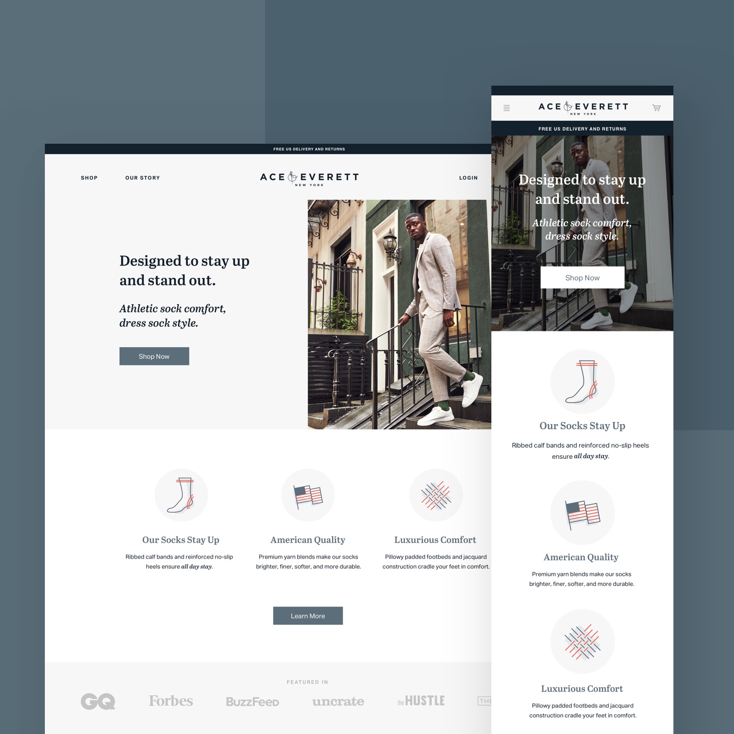
For the homepage we freshened up the above-the-fold presence through a new banner with an own-able statement and CTA. Opportunities to learn more about the product were added through the use of custom illustrated icons, testimonials and strategic CTA placement.
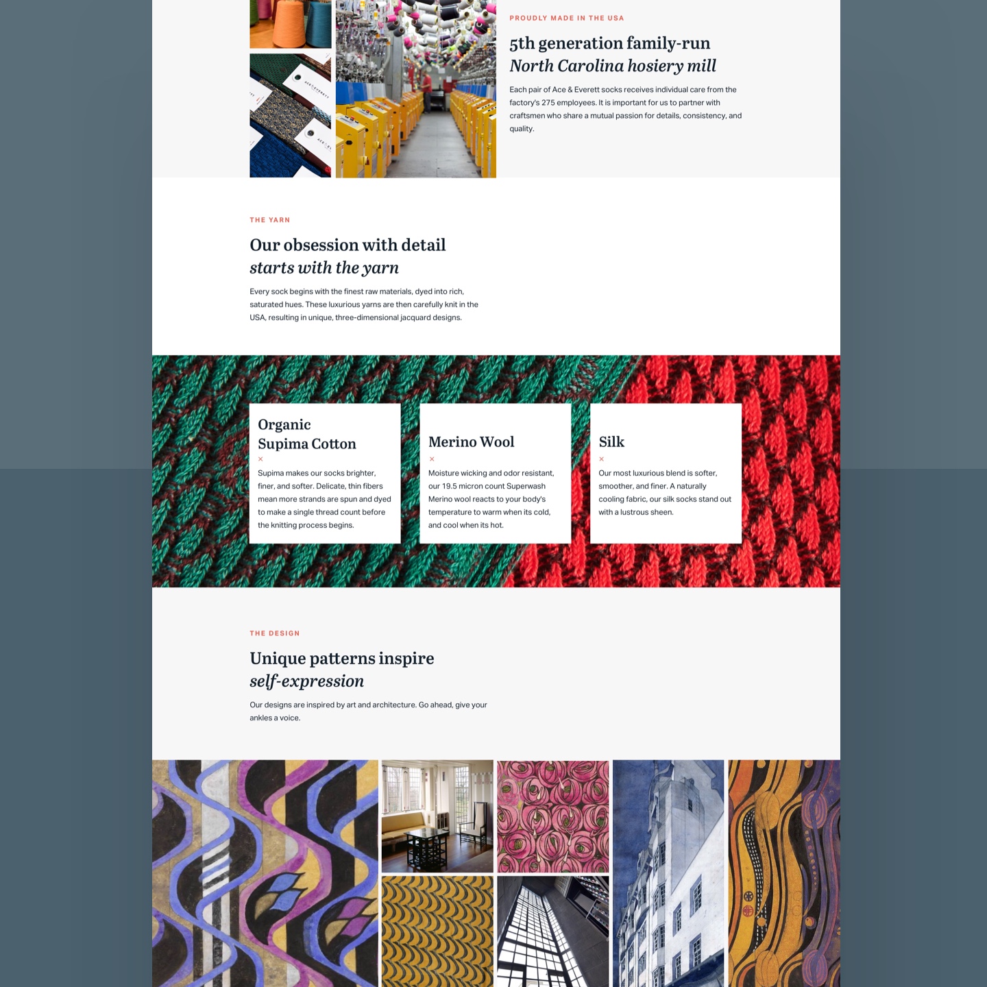
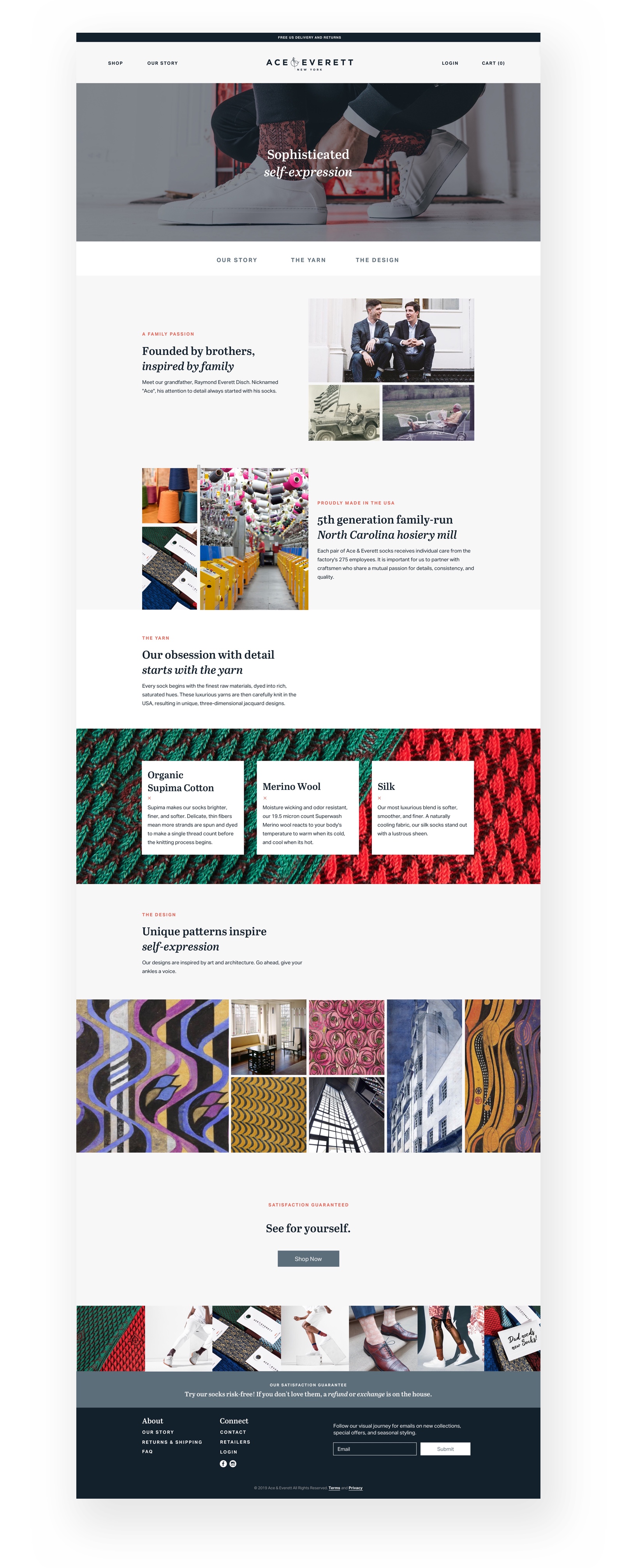
I changed their "About" page to now be called "Our Story" to better highlight how important their family history is to this brother-founded company. This page was separated into three sections- Our Story, The Yarn, and The Design. Each section shines more light into what makes this company and its products so different.
We simplified the Shop page by stripping out all dividers to create a continuous scroll of sock styles and colors for a more seamless experience. Within each card, all product names were simplified and yarn materials were added for easier product comparison. A hover "quick add" button was added on desktop, requiring an intuitive 3 step hover state that allows for quantity selection.
“We could not be more pleased with our website. Brielle’s work and ability to tell our vision visually exceeded our expectations.”
CODY DISCH - CO-FOUNDER OF ACE AND EVERETT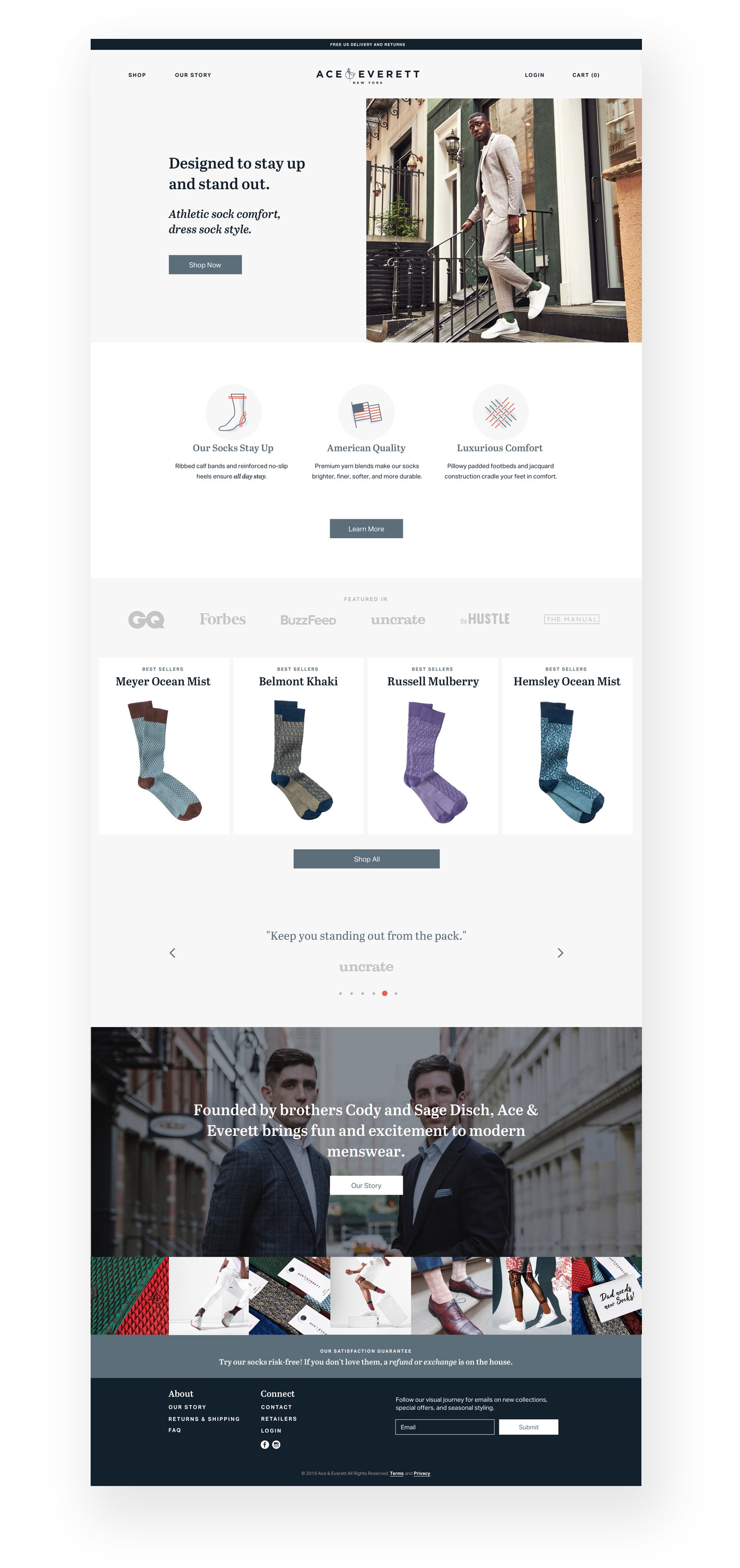

Get in touch to schedule your free consultation.
