Mockingbird
A direct-to-consumer baby product company on a mission to empower the next generation of parents.
A direct-to-consumer baby product company on a mission to empower the next generation of parents.


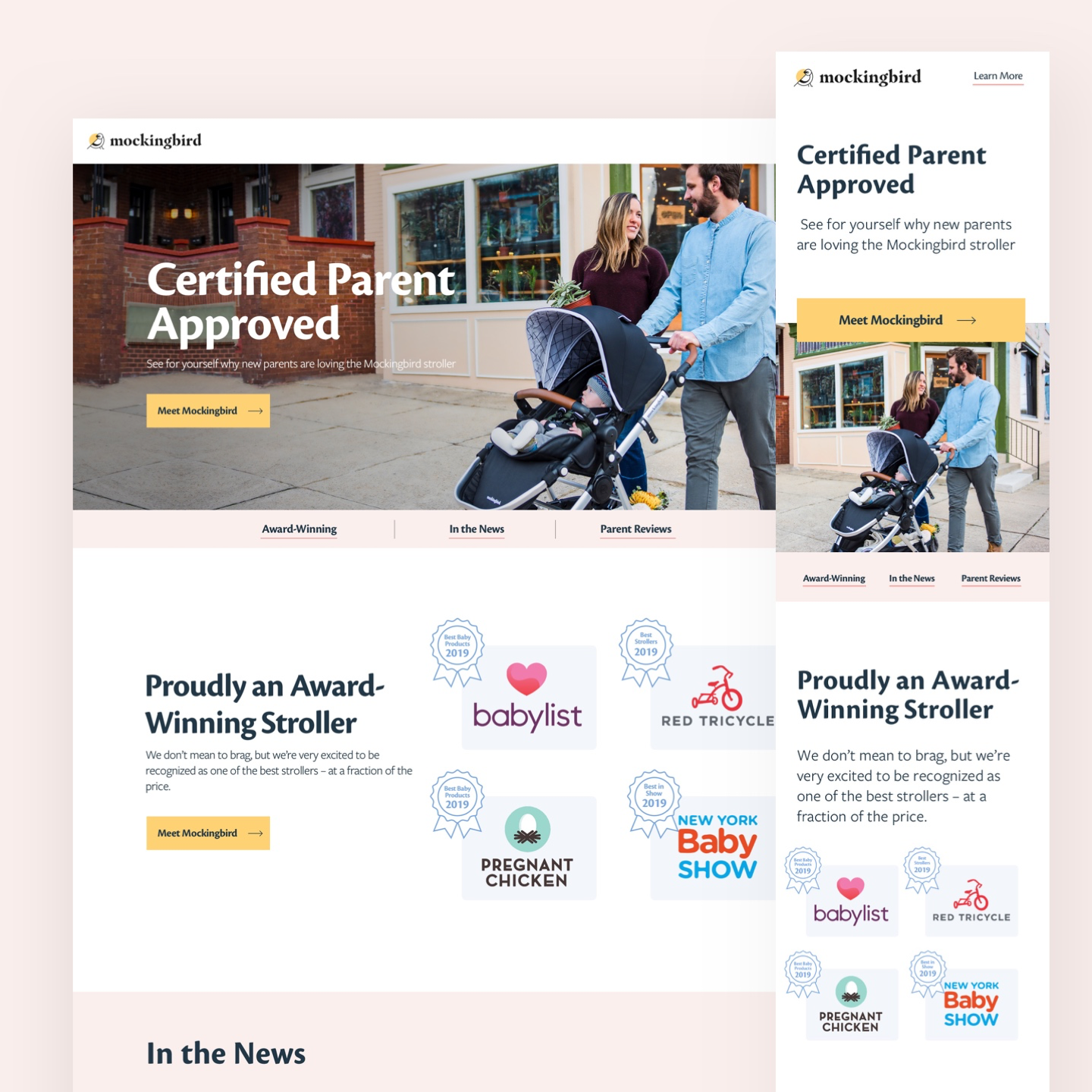
New parents are exceedingly cautious when it comes to purchasing products for their baby and spend a large amount of time researching and comparing their options. Because of this, Mockingbird was looking to create a new landing page focused on creating a sense of trust for their customers through third-party validation.
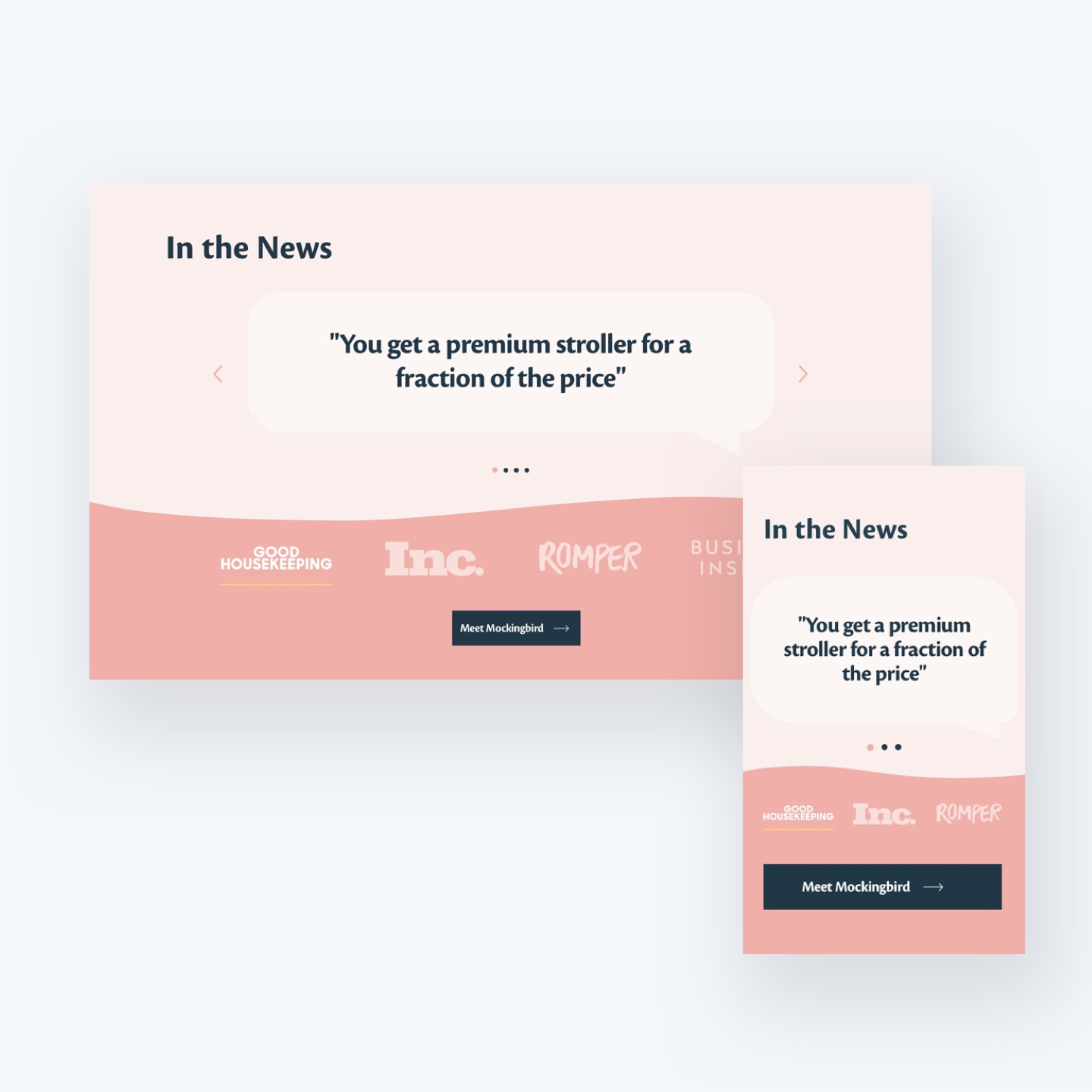
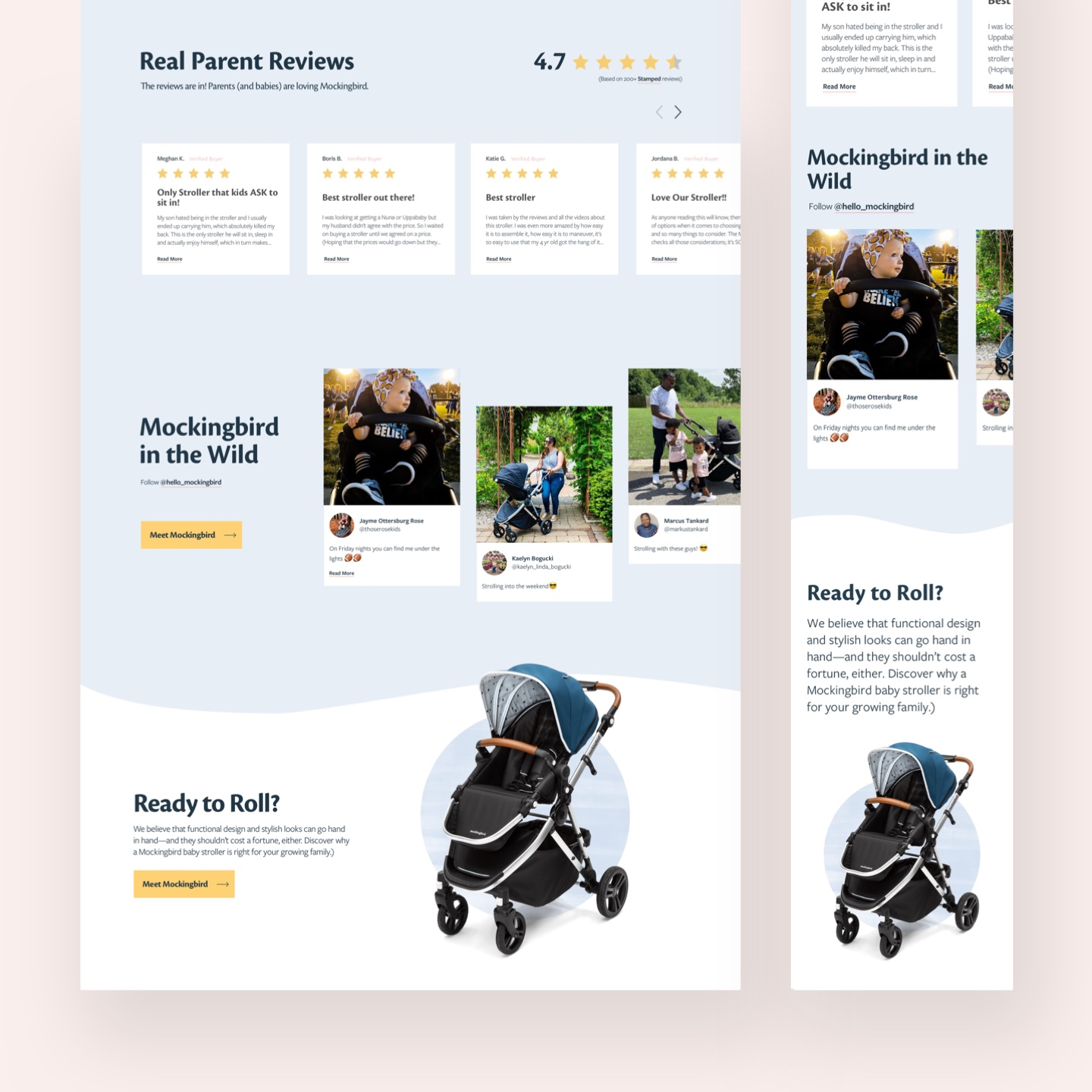
My goal was to expand on Mockingbird’s existing branding to design a page which felt more approachable in order to create a fun shopping experience that feels more like a trusted friend rather than a salesman. I organized the page into three different sources of validation, and added an anchor tag banner at the top of the page to quickly educate the customer on the page’s contents.


Curved lines were added to soften the divider between sections, incentivizing the user to continue scrolling down the page. Real parent reviews and social posts were strategically placed overflowing off the edges of the screen to imply an action (scrolling, clicking etc) can be taken to see information, without needing to sacrifice precious vertical screen space.
“"Brielle has been incredible at coming up with new concepts and designs for our website and printed materials. She is user-focused, a clear communicator, and a great partner in helping to grow our brand.
ANDREW IGDALOFF - MOCKINGBIRD